Monday, February 28, 2011

The 28th February........


.....is an important day for these cufflinks. Silver with a square Aquamarine.

Sunday, February 27, 2011

Cufflinks inspired by a forgotten place


These cufflinks were inspired by a concrete wall in Glasgow's Anderston Centre which sadly no longer exists. It was a cast concrete wall composed of juxtaposing square blocks at different angles stretching along the length of a landscaped area. A wonderful example of 1960's futurism.

Anderston's concrete structure continues to inspire, despite its demise and almost eerie emptiness. There is something poignant about its brave architecture, its unnappreciated concrete buildings that continue to struggle on admist rumours of demolition and the winds of change.

Thursday, February 24, 2011

Silver earrings in a white landscape.


Reminiscent of butterfly wings, but inspired by intersecting branches, these hand sawn silver earrings are light but very graphical.

Tuesday, February 22, 2011

Papillons de nuit - A preliminar sketch


I like the idea of quite delicate and fragile night butterflies, angular and stylised, flocking to the light. Masses of delicate little creatures fluttering in a still around a bare desolate light source - industrial and minimal in it's existance. I would like to capture an essence of movement and fragility towards a simple light source.

The aim is to achieve a sculptural light that is both poetic yet raw at the same time. In this sketch I wanted to see how the thin wings could be constructed to capture movement and to observe how light was conveyed through the graphic.

'Papillions de nuit' is a theme that I'd like to extend into a collection of jewellery..... for the night.

Saturday, February 19, 2011

Sweet Nature, but not from the source.


Not quite the misty morning that inspired this brooch, but a fitting place to photograph the result.

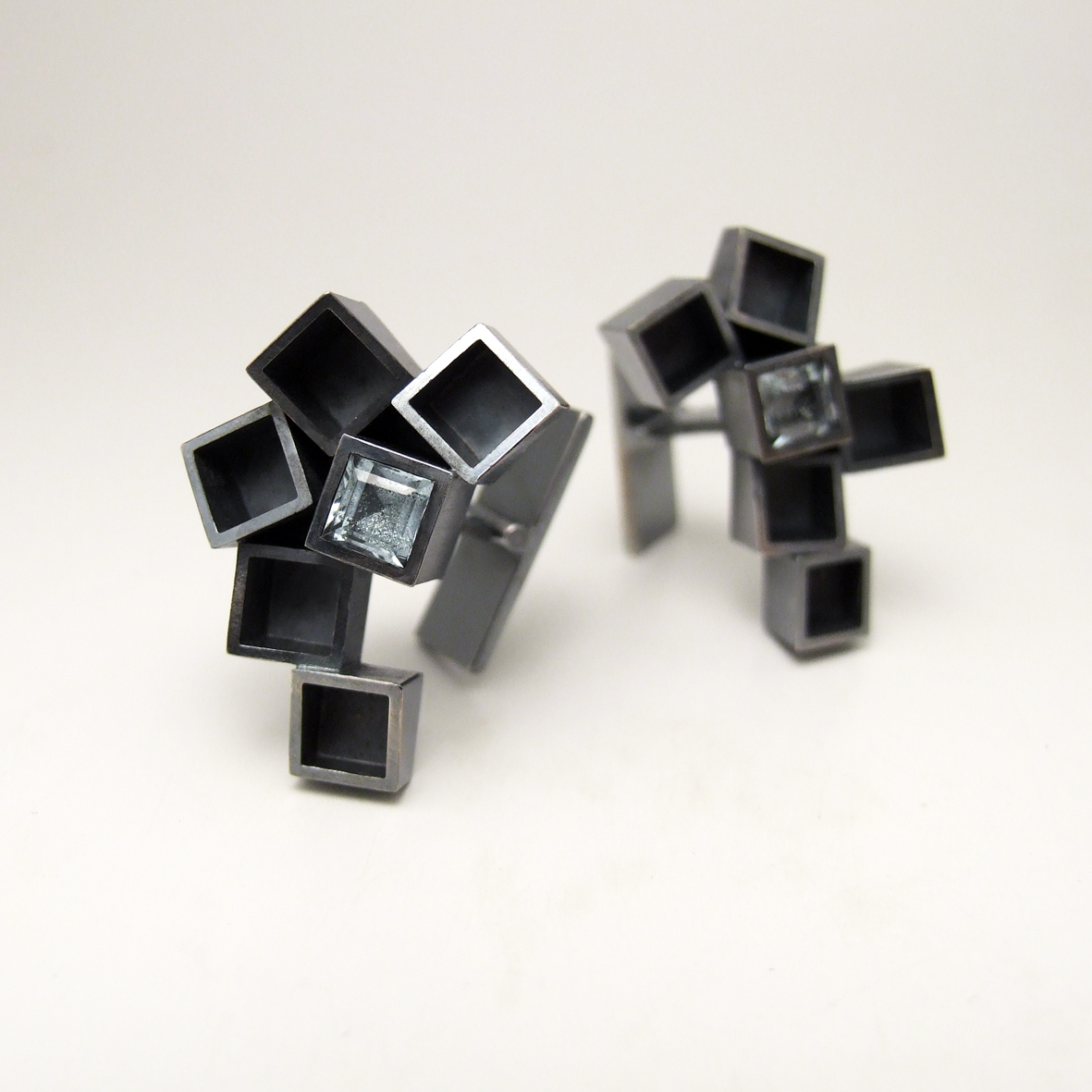
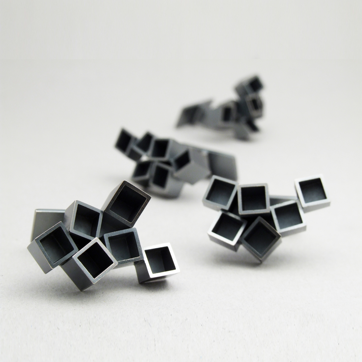
Knarled branches, overlapping, intersecting and framed against the diffuse light of the early morning was the inspiration for this collection. It was actually in England, just outside Henley on Thames, where strange mists frame the landscape in a beautiful fashion, that the original photograph was taken. It wasn't until several years later that I spotted the potential of those sharp black lines accentuated against the hazy light of the morning.

In this case translated into a brooch. Oxidised silver, hand sawn, with a white pearl.

Thursday, February 17, 2011

Graphics in the workshop - black, white, silver.... and green!


I like the possibilities of interpreting the 'simple' T bar catch grapically. This design is going to form the backside of some necklaces that I am working on, continuing the feel of the design right through from front to back.

This photo captures the trial catch, checking that the weight balance works. Again the power of repetition can reveal the potential for development into other pieces. A pile of 'T's and a bracelet could be on the cards?

A little mention has to go out to the gloriously delicious graphics that hang around LOD from time to time. There's a few contenders but this week's winner is namely 'Super Sculpey'.  Klara bought this clay to mould and hammer against, but the true value of this product lies in it's graphic profile? I have to bow down to the supreme quality of the graphic design here. Simply sublime with a hint of green! Goregous and very very inspirational.

Black diamonds shine in a different way


The colour of Palladium accentuates the blackness of these diamonds and together they make a beautiful, unusual combination.

Tuesday, February 15, 2011

A thin gold line


This was an interesting project to be a part of because initially I was sceptical as to how such thin proportions would work in relation to the body. After sugessting that we try two models in brass to check how the design looked and felt in practice, I was very pleasantly surprised.

The thinnest of lines with slight hammer marks can exude such elegance. Less is more, especially when it comes in Swedish red gold.

Monday, February 14, 2011

February's Rings are light and fair


These slightly rounded titanium rings with a satin finish accentuate the scattered diamonds that glimmer like ice droplets against the soft tones of the metal. Accompanied by a thin white gold ring with a highly polished finish, the contrast is felt both in the differing weights and surface quality, yet they compliment one another perfectly.

February's rings are light and fair. Lovely symbols for a winter wedding and a life long commitment.

Tuesday, February 8, 2011

Ghost images in the wake of silver


Today I've been sanding, sanding, and sanding in preparation for the final solderings to these necklaces as the long awaited silver tubing has arrived.

Transient reproductions appear on 240 grit, shadows of the lines formed in silver dust, and lost to the wind.

Monday, February 7, 2011

Let There Be Light.


This candleholder has been designed to be flexible and adaptable to different situations at the table or sideboard. Following the lines in the centre the separate units can be positioned to grow graphically along a table, casting subtle light at a low level, or grouped together for a distictly more initimite feeling. 

I'm going to show you the sketches, the models, the possibilities and the future of this design as it moves metal and feeling.

A special Thank You to Christian Habetzeder who took this photograph and who is an inspiration to work with. Do take the time to look at Christian's work at http://www.habetzeder.se/

Sunday, February 6, 2011

Naughty or Nice?


That is the question.......
This little unassuming ring spawned a series of etheral pieces in it's wake and was inspired by a bag of buttons from Belgrade. It's strangely unpredictable how new designs emerge and grow from paths crossing and objects with a story to tell.